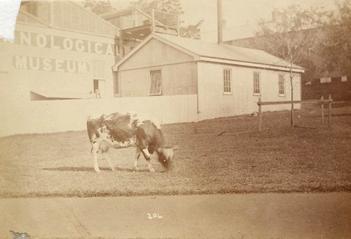
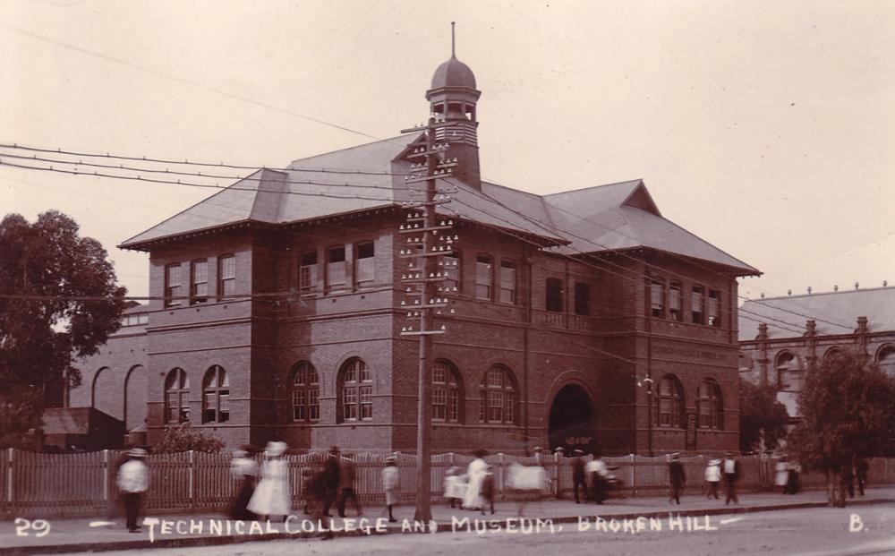
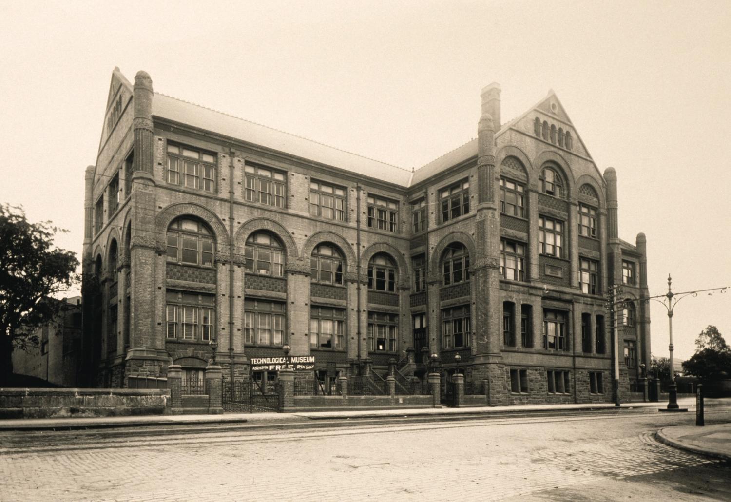


Located in Sydney, Powerhouse Museum is the largest museum group in Australia. It sits at the intersection of the arts, design, science and technology and plays a critical role in engaging communities with contemporary ideas and issues. It is custodian to more than half a million objects of national and international significance, and is considered one of the finest and most diverse collections in Australia.
Powerhouse will continue to present programs at Powerhouse Castle Hill and Sydney Observatory during the construction of Powerhouse Parramatta and the revitalisation of Powerhouse Ultimo.
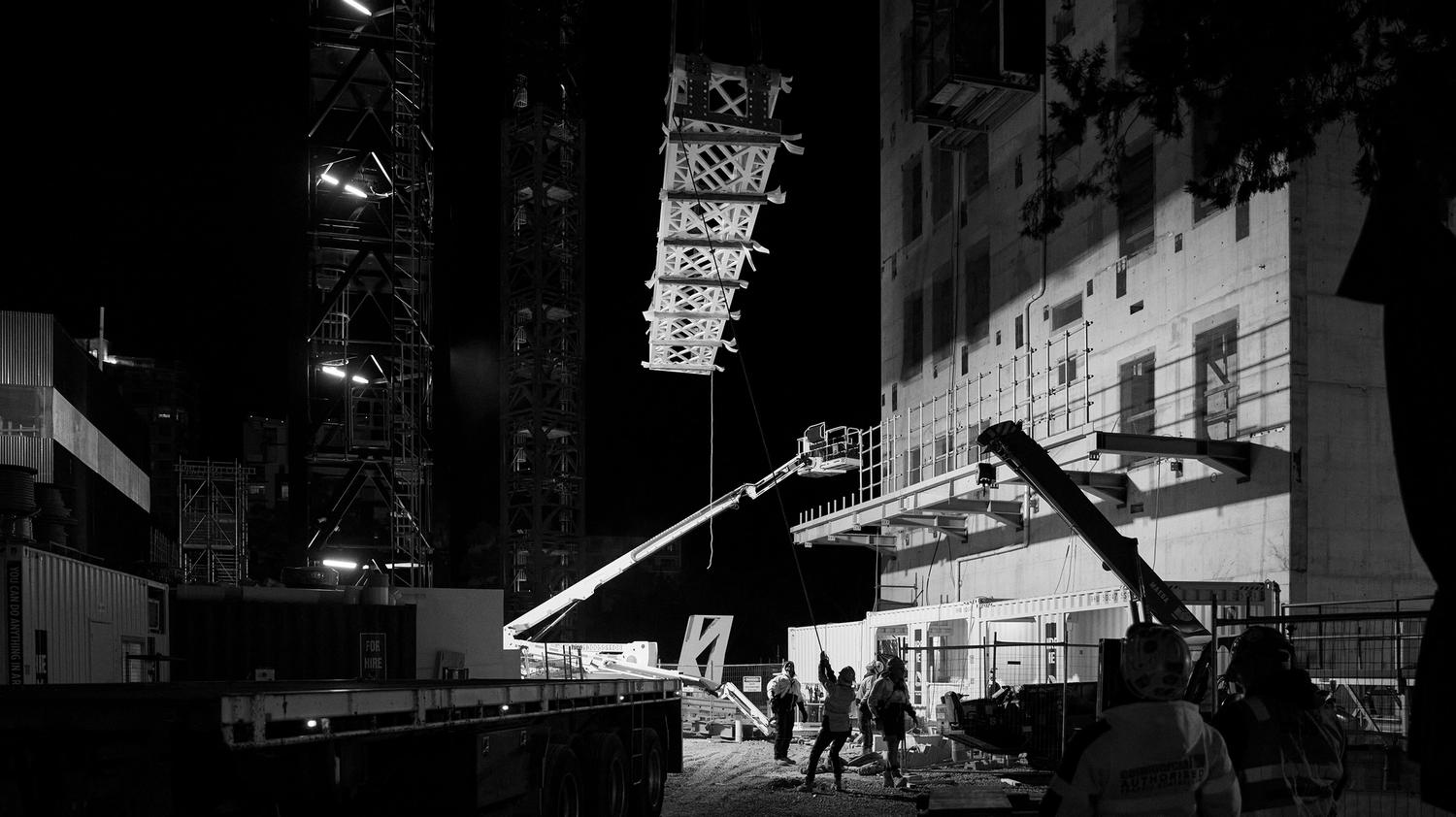
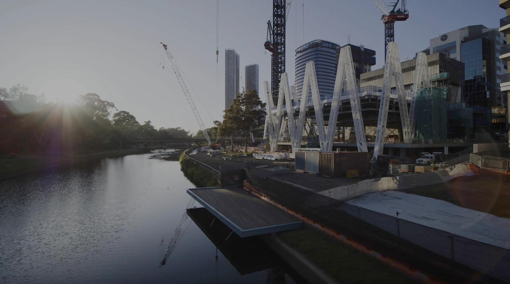
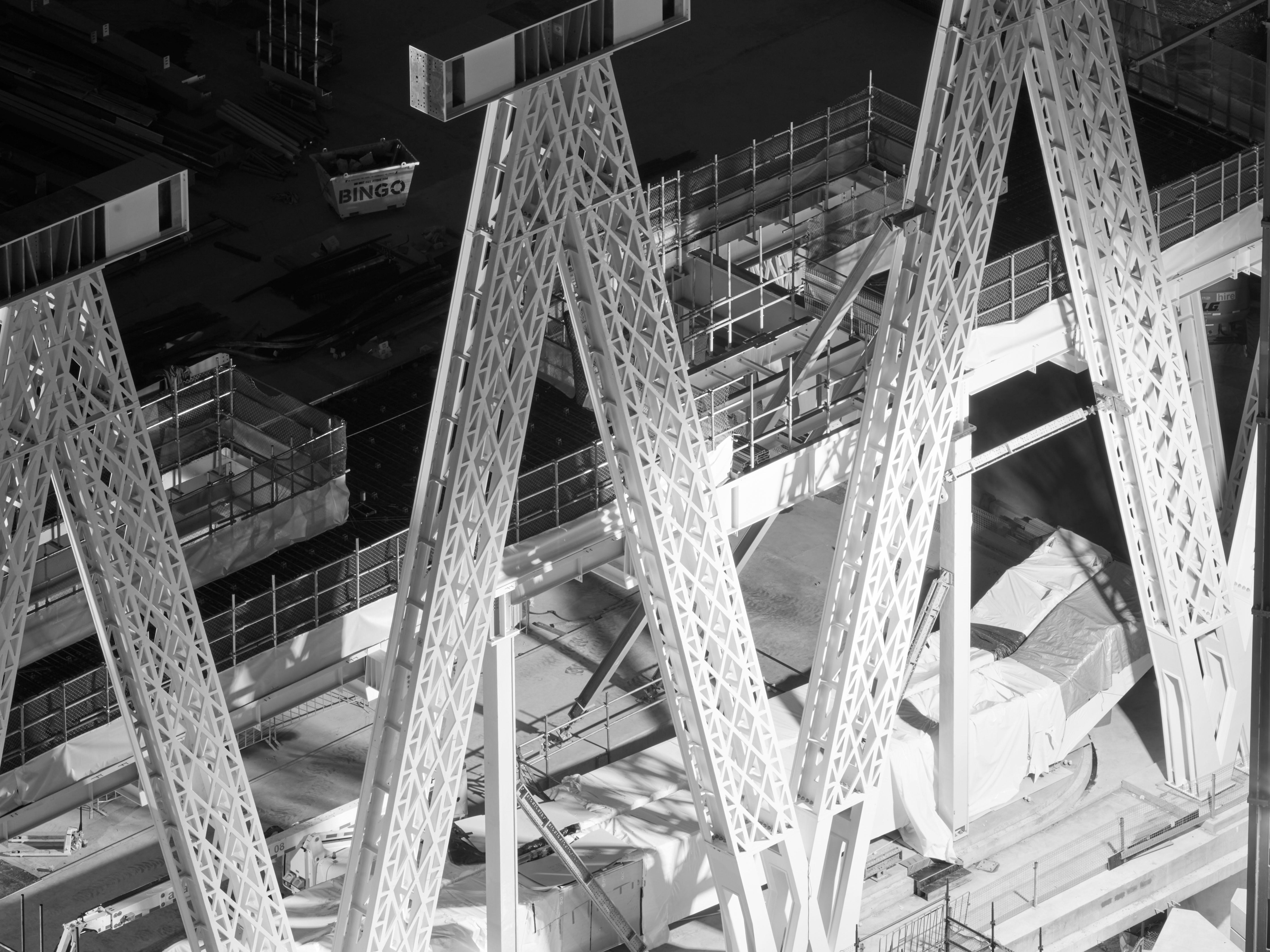
Powerhouse Parramatta
Under Construction
On Dharug land
Powerhouse Parramatta will be one of the world's most significant new museums. Community, industry and collection will intersect to create a dynamic culturally engaged program that will redefine museums. Powerhouse Parramatta is located within one of Australia's fastest growing and most diverse communities.
More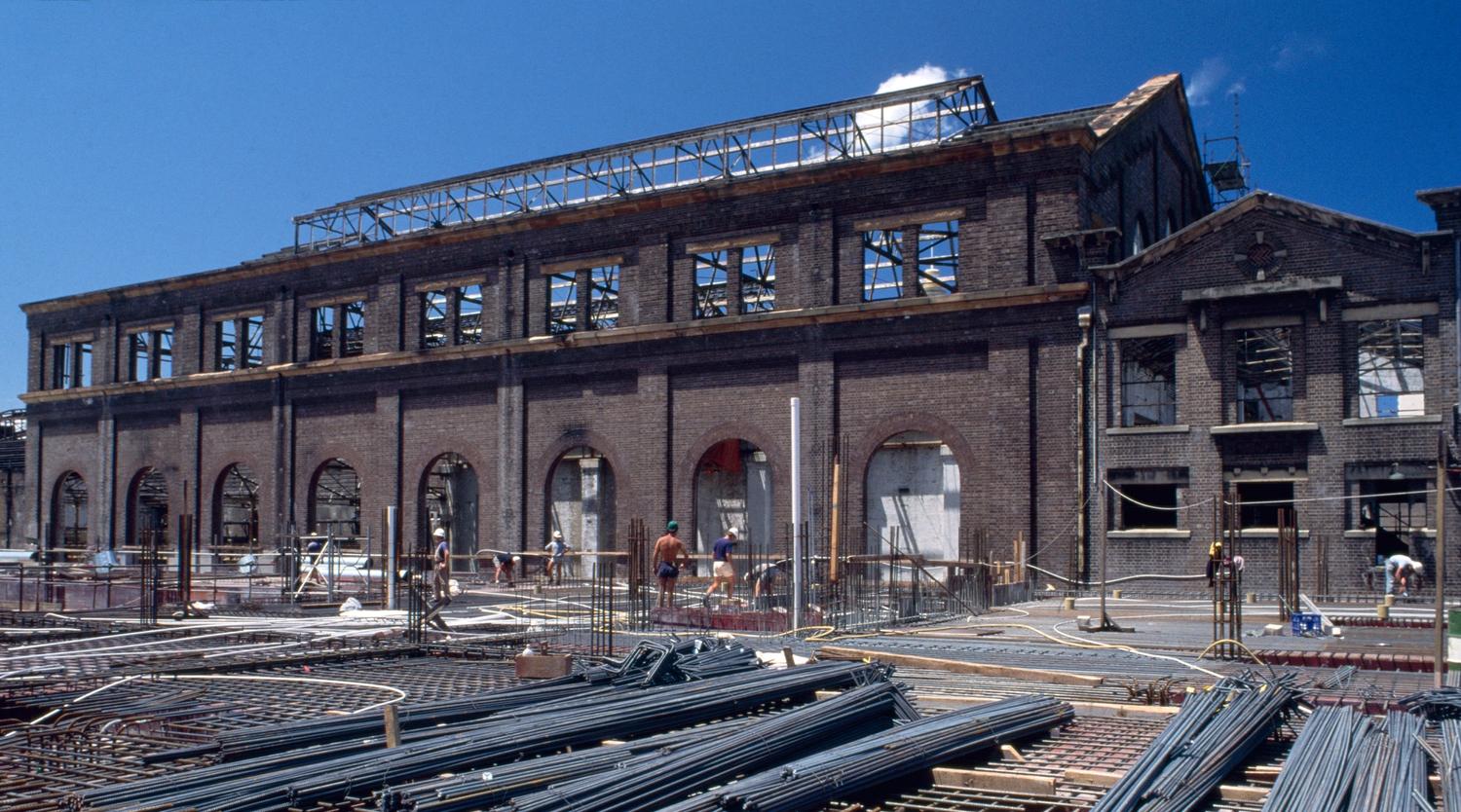
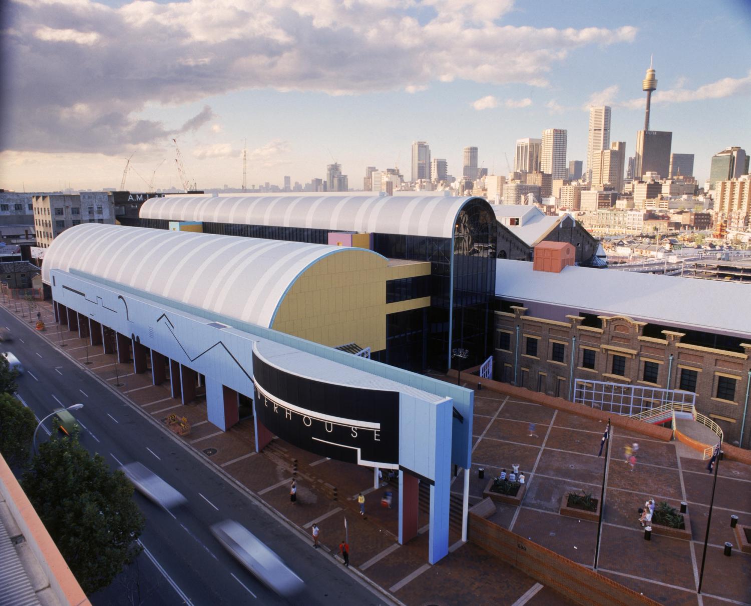
Powerhouse Ultimo
Heritage Revitalisation
On Gadigal land
Powerhouse Ultimo is undergoing a significant heritage revitalisation that will deliver new and expanded spaces to showcase the museum's renowned collection and present exclusive international exhibitions. This revitalisation will also enable Powerhouse to expand education programming that supports the applied arts and sciences, and creative industries.
Temporarily closed
More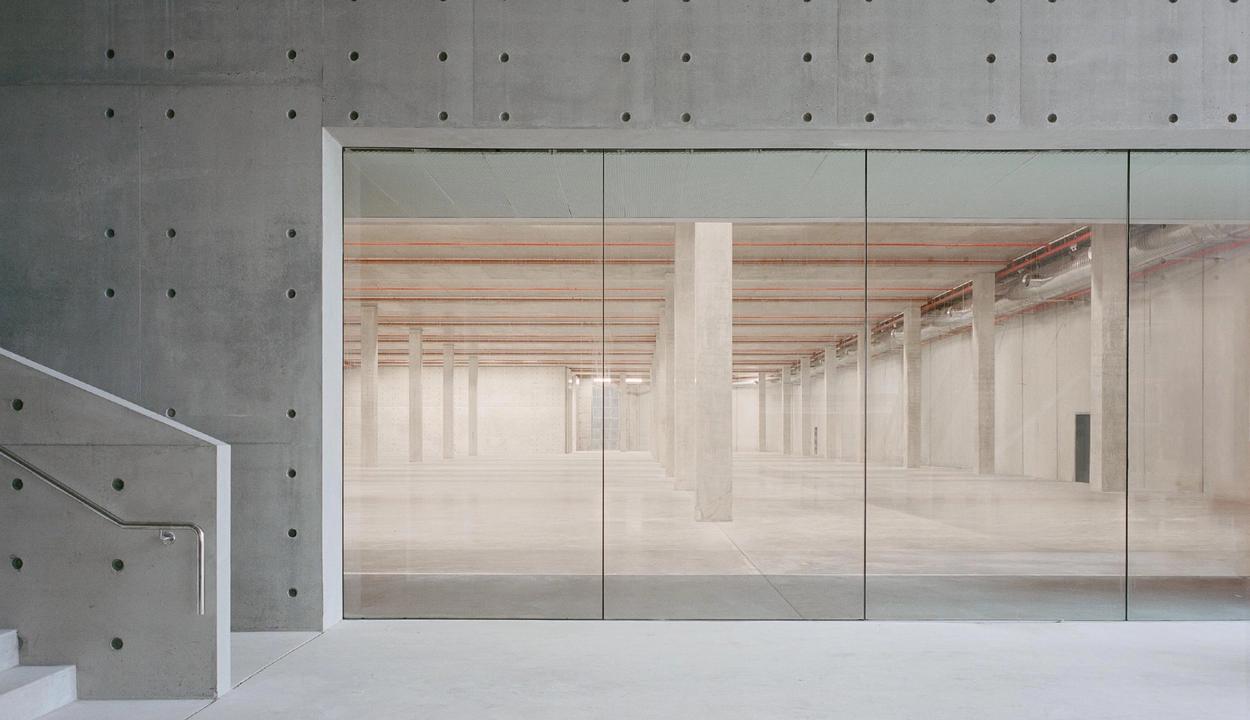
Powerhouse Castle Hill
On Dharug land
Powerhouse Castle Hill is a new state-of-the-art facilities for the storage and preservation of the Powerhouse Collection, which contains more than half a million objects. It is open to the community every weekend.
Open Weekends 10am–4pm
Visit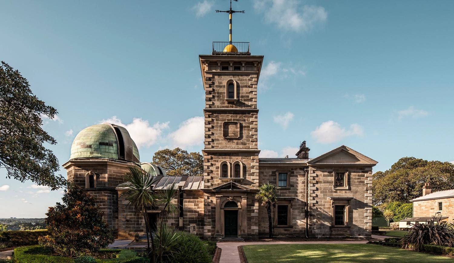
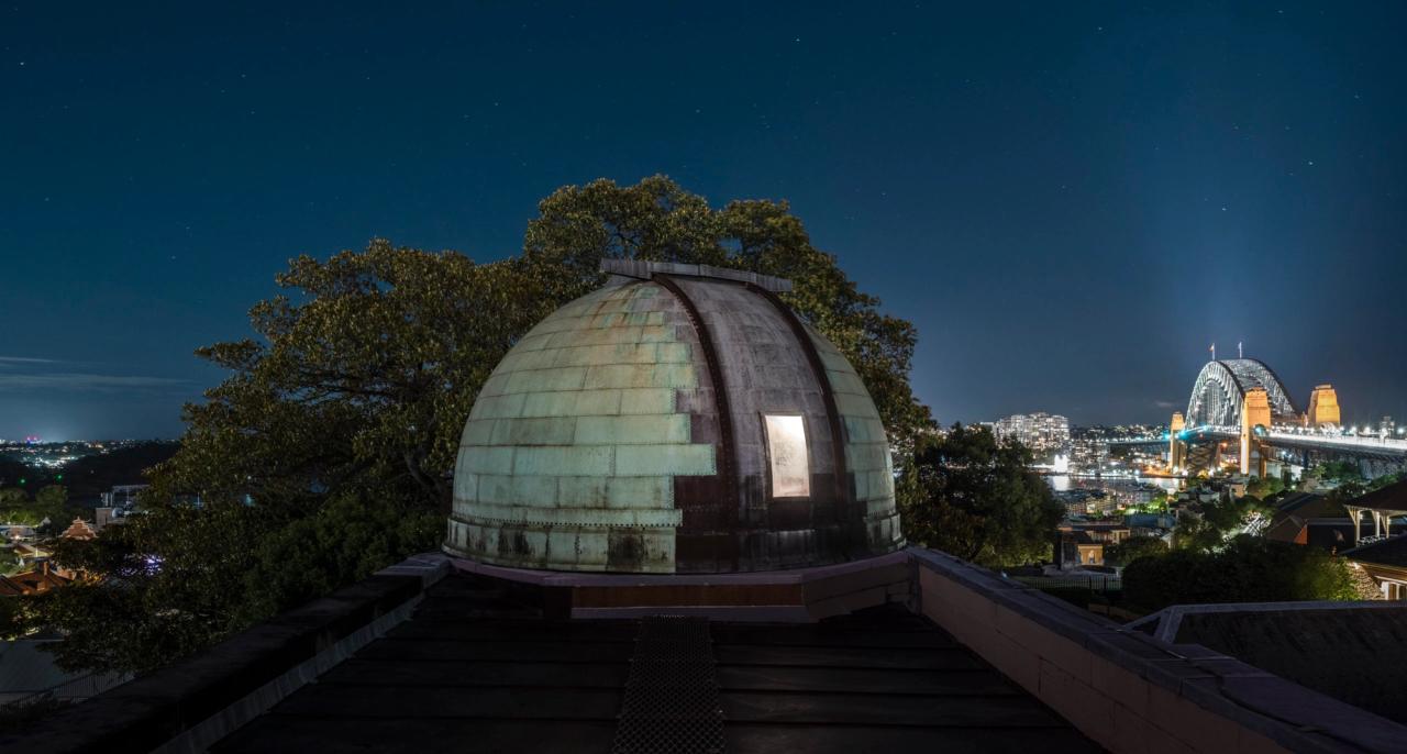
Sydney Observatory
On Gadigal land
Sydney Observatory is a national place of connection and research of astronomy, meteorology and science.
Open for pre-booked tours Wednesday – Saturday
BookStay up to date
Be the first to know about Powerhouse events, collaborations and opportunities.
Program
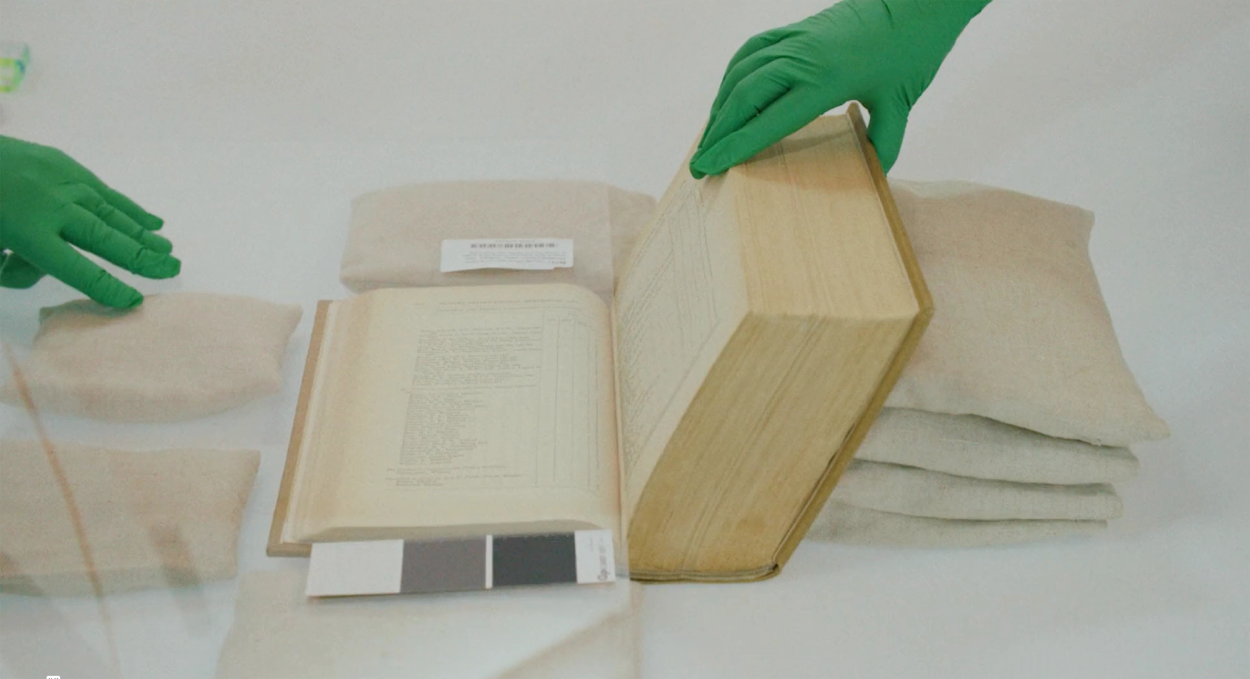
Powerhouse Collection
Since 2019, Powerhouse has been working on one of the world's largest digitisation projects to ensure our collection is more accessible to the community. More than 338,000 objects have been digitised to date and are now available to view online.
Digitising Powerhouse Object 347,172